【wordpress】ブロックサイドバーのカスタマイズ方法(自作ブロック)
wordpressのブロックエディタ「Gutenberg」でReactを使って自作したブロックのサイドバーをカスタマイズする方法を紹介します。

目次から読む
wordpressでReactを使って自作したブロックのサイドバーをカスタマイズする方法
edit.jsで以下を使用していきます。InspectorControls
import {
	InspectorControls,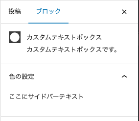
} from '@wordpress/block-editor'; <InspectorControls>
<p>ここにサイドバーテキスト</p>
</InspectorControls>PanelBody
import { PanelBody } from '@wordpress/components';<InspectorControls>
<PanelBody
title={ __( '色の設定', 'text-box' ) }
icon="admin-apprearance"
initialOpen
>
<p>ここにサイドバーテキスト</p>
</PanelBody>
</InspectorControls>TextControl
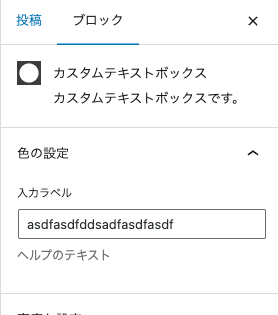
import { PanelBody, TextControl } from '@wordpress/components'; <InspectorControls>
<PanelBody
title={ __( '色の設定', 'text-box' ) }
icon="admin-apprearance"
initialOpen
>
<TextControl
label="入力ラベル"
value={ text }
onChange={ onChangeText }
help="ヘルプのテキスト"
/>
</PanelBody>
</InspectorControls>TextareaControl
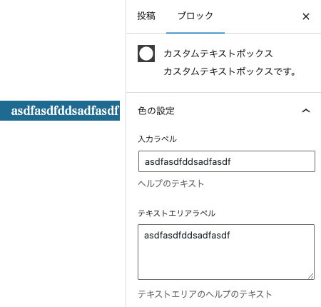
import { PanelBody, TextControl, TextareaControl } from '@wordpress/components'; <InspectorControls>
<PanelBody
title={ __( '色の設定', 'text-box' ) }
icon="admin-apprearance"
initialOpen
>
<TextControl
label="入力ラベル"
value={ text }
onChange={ onChangeText }
help="ヘルプのテキスト"
/>
<TextareaControl
label="テキストエリアラベル"
value={ text }
onChange={ onChangeText }
help="テキストエリアのヘルプのテキスト"
/>
</PanelBody>
</InspectorControls>ToggleControl
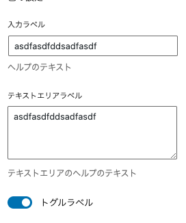
import { PanelBody, TextControl, TextareaControl, ToggleControl } from '@wordpress/components'; <InspectorControls>
<PanelBody
title={ __( '色の設定', 'text-box' ) }
icon="admin-apprearance"
initialOpen
>
<ToggleControl
label="トグルラベル"
checked={ true }
onChange={ ( value ) => console.log( value ) }
/>
</PanelBody>
</InspectorControls>ColorPalette
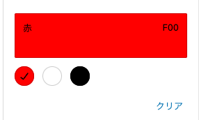
指定した色を表示できるColorPaletteも使えます。import {
PanelBody,
ColorPalette,
} from '@wordpress/components'; "attributes": {
"text": {
"type": "string",
"source": "html",
"selector": "h4"
},
"alignment": {
"type": "string",
"default": "left"
},
"backgroundColor": {
"type" : "string"
},
"textColor": {
"type" : "string"
}
}export default function Edit( { attributes, setAttributes } ) {
// attributesはblock.jsonで定義したattributes
const { text, alignment, backgroundColor, textColor } = attributes;
const onBackgroundColorChange = ( newBgColor ) => {
setAttributes( { backgroundColor: newBgColor } );
};
const onTextColorChange = ( newTextColor ) => {
setAttributes( { textColor: newTextColor } );
};
return (
<>
<InspectorControls>
<PanelBody
title={ __( '色の設定', 'text-box' ) }
icon="admin-apprearance"
initialOpen
>
<ColorPalette
colors={ [
{
name: '赤',
color: '#F00',
},
{
name: '白',
color: '#FFF',
},
{
name: '黒',
color: '#000',
},
] }
onChange={ onBackgroundColorChange }
value={ backgroundColor }
/>
</PanelBody>
</InspectorControls>
<RichText
{ ...useBlockProps( {
className: `text-box-align-${ alignment }`,
style: {
backgroundColor,
},
} ) }
onChange={ onChangeText }
value={ text }
placeholder={ __( '入力してください。', 'text-box' ) }
tagName="h4"
allowedFormats={ [] }
/>
</>
);
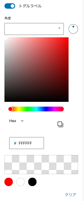
}その他:AnglePickerControl、ColorPicker
その他にも角度を制御できるAnglePickerControl、色を選択できるColorPickerなどのコンポーネントもあります。import {
PanelBody,
TextControl,
TextareaControl,
ToggleControl,
AnglePickerControl,
ColorPicker,
ColorPalette,
} from '@wordpress/components';<InspectorControls>
<PanelBody
title={ __( '色の設定', 'text-box' ) }
icon="admin-apprearance"
initialOpen
>
<AnglePickerControl />
<ColorPicker
color={ '#fff' }
onChange={ ( value ) => console.log( value ) }
/>
<ColorPalette colors={[
{
name: "赤",
color: "#F00"
},
{
name: "白",
color: "#FFF"
},
{
name: "黒",
color: "#000"
},
]}/>
</PanelBody>
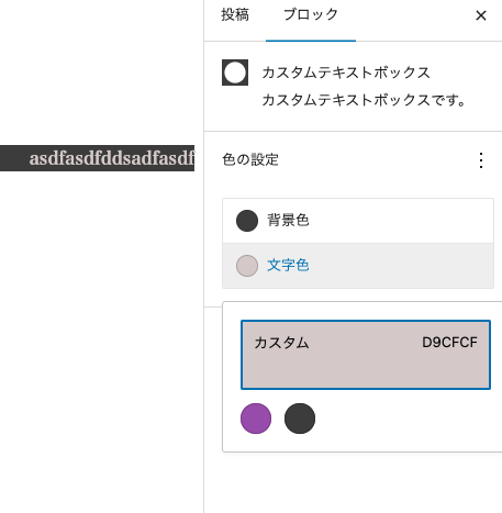
</InspectorControls>PanelColorSettings
ColorPaletteコンポーネントと似ていますが、大きく違う点は、PanelColorSettingsコンポーネントはfunctions.phpで設定したeditor-color-paletteから色を取得できるという点です。 テーマカラーを限定している場合、とても便利です。import { __ } from '@wordpress/i18n';
// InspectorControlsはブロック選択したときのサイドバー部分
import {
useBlockProps,
RichText,
BlockControls,
InspectorControls,
AlignmentToolbar,
PanelColorSettings,
} from '@wordpress/block-editor';
import './editor.scss';
export default function Edit( { attributes, setAttributes } ) {
// attributesはblock.jsonで定義したattributes
const { text, alignment, backgroundColor, textColor } = attributes;
const onChangeText = ( newText ) => {
setAttributes( { text: newText } );
};
const onChangeAlignment = ( newAligment ) => {
setAttributes( { alignment: newAligment } );
};
const onBackgroundColorChange = ( newBgColor ) => {
setAttributes( { backgroundColor: newBgColor } );
};
const onTextColorChange = ( newTextColor ) => {
setAttributes( { textColor: newTextColor } );
};
return (
<>
<InspectorControls>
<PanelColorSettings
title={ __( '色の設定', 'text-box' ) }
icon="admin-appearance"
initialOpen
disableCustomColors={ false }
colorSettings={ [
{
value: backgroundColor,
onChange: onBackgroundColorChange,
label: __( '背景色', 'text-box' ),
},
{
value: textColor,
onChange: onTextColorChange,
label: __( '文字色', 'text-box' ),
},
] }
></PanelColorSettings>
<RichText
{ ...useBlockProps( {
className: `text-box-align-${ alignment }`,
style: {
backgroundColor,
color: textColor,
},
} ) }
onChange={ onChangeText }
value={ text }
placeholder={ __( '入力してください。', 'text-box' ) }
tagName="h4"
/>
</>
);
}
disableCustomColors={ true }とすれば可能です。
ContrastChecker
ContrastCheckerは、PanelColorSettingsコンポーネント内で使用すると、たとえば背景色と文字色が同じような色の場合、以下のような警告メッセージを表示してくれます。import { __ } from '@wordpress/i18n';
// InspectorControlsはブロック選択したときのサイドバー部分
import {
useBlockProps,
RichText,
BlockControls,
InspectorControls,
AlignmentToolbar,
PanelColorSettings,
ContrastChecker,
} from '@wordpress/block-editor';
import './editor.scss';
export default function Edit( { attributes, setAttributes } ) {
// attributesはblock.jsonで定義したattributes
const { text, alignment, backgroundColor, textColor } = attributes;
const onChangeText = ( newText ) => {
setAttributes( { text: newText } );
};
const onChangeAlignment = ( newAligment ) => {
setAttributes( { alignment: newAligment } );
};
const onBackgroundColorChange = ( newBgColor ) => {
setAttributes( { backgroundColor: newBgColor } );
};
const onTextColorChange = ( newTextColor ) => {
setAttributes( { textColor: newTextColor } );
};
return (
<>
<InspectorControls>
<PanelColorSettings
title={ __( '色の設定', 'text-box' ) }
icon="admin-appearance"
initialOpen
disableCustomColors={ false }
colorSettings={ [
{
value: backgroundColor,
onChange: onBackgroundColorChange,
label: __( '背景色', 'text-box' ),
},
{
value: textColor,
onChange: onTextColorChange,
label: __( '文字色', 'text-box' ),
},
] }
>
{/* コントラストがうすすぎないかチェック */}
<ContrastChecker
textColor={ textColor }
backgroundColor={ backgroundColor }
/>
</PanelColorSettings>
<RichText
{ ...useBlockProps( {
className: `text-box-align-${ alignment }`,
style: {
backgroundColor,
color: textColor,
},
} ) }
onChange={ onChangeText }
value={ text }
placeholder={ __( '入力してください。', 'text-box' ) }
tagName="h4"
/>
</>
);
}